plot_gsea() produces useful plots to visualize the results of the
gene set enrichment analysis.
Arguments
- enrichment
The results of the gene set enrichment analysis.
- de_results
A tibble containing the results of a differential expression analysis. It should be the same as the one used in
do_gsea().- pval_lim
The p-value threshold to consider a term as significant.
- ncateg
The number of categories to show in the plots.
- fontsize
The font size for the plots.
Examples
# Perform Differential Expression Analysis
control = c("BRC", "CLL", "CRC", "CVX", "ENDC", "GLIOM", "LUNGC", "LYMPH", "MYEL", "OVC", "PRC")
de_res <- do_limma(example_data,
example_metadata,
case = "AML",
control = control,
wide = FALSE)
#> Comparing AML with BRC, CLL, CRC, CVX, ENDC, GLIOM, LUNGC, LYMPH, MYEL, OVC, PRC.
de_results <- de_res$de_results
# Run GSEA with Reactome database
enrichment <- do_gsea(de_results, database = "GO", pval_lim = 0.9)
#> 'select()' returned 1:1 mapping between keys and columns
#> using 'fgsea' for GSEA analysis, please cite Korotkevich et al (2019).
#> preparing geneSet collections...
#> GSEA analysis...
#> leading edge analysis...
#> done...
# Plot the results
plot_gsea(enrichment, de_results, pval_lim = 0.9, ncateg = 7, fontsize = 7)
#> $dotplot
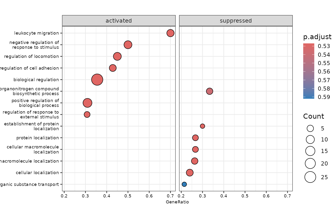 #>
#> $cnetplot
#>
#> $cnetplot
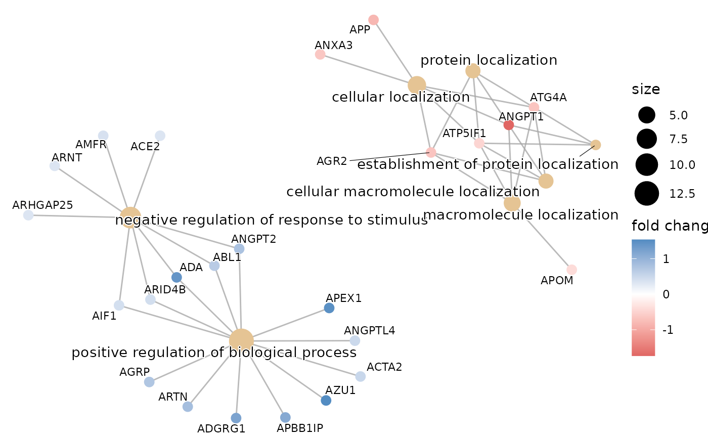 #>
#> $ridgeplot
#> Picking joint bandwidth of 0.17
#>
#> $ridgeplot
#> Picking joint bandwidth of 0.17
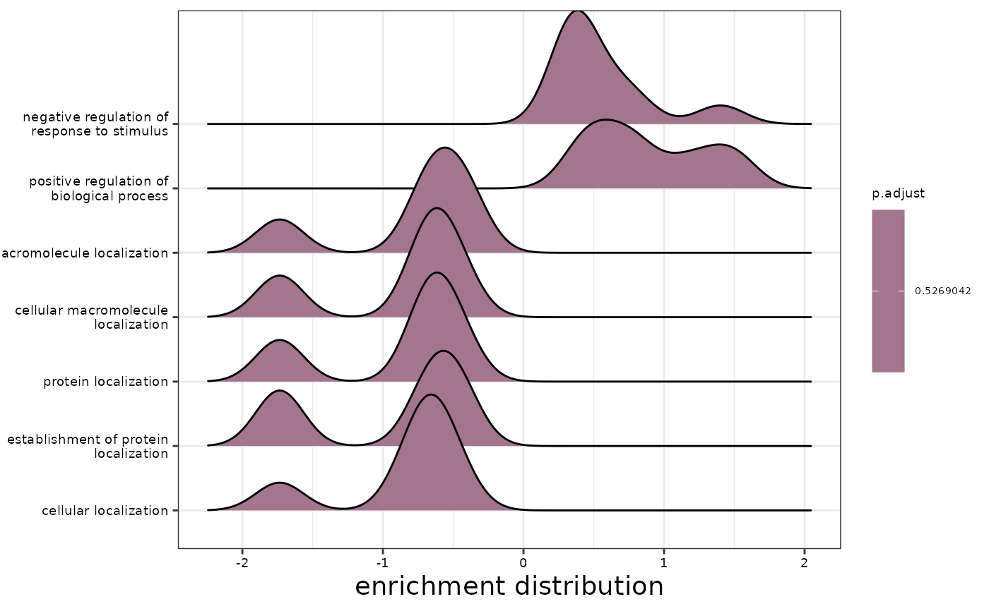 #>
#> $gseaplot
#>
#> $gseaplot
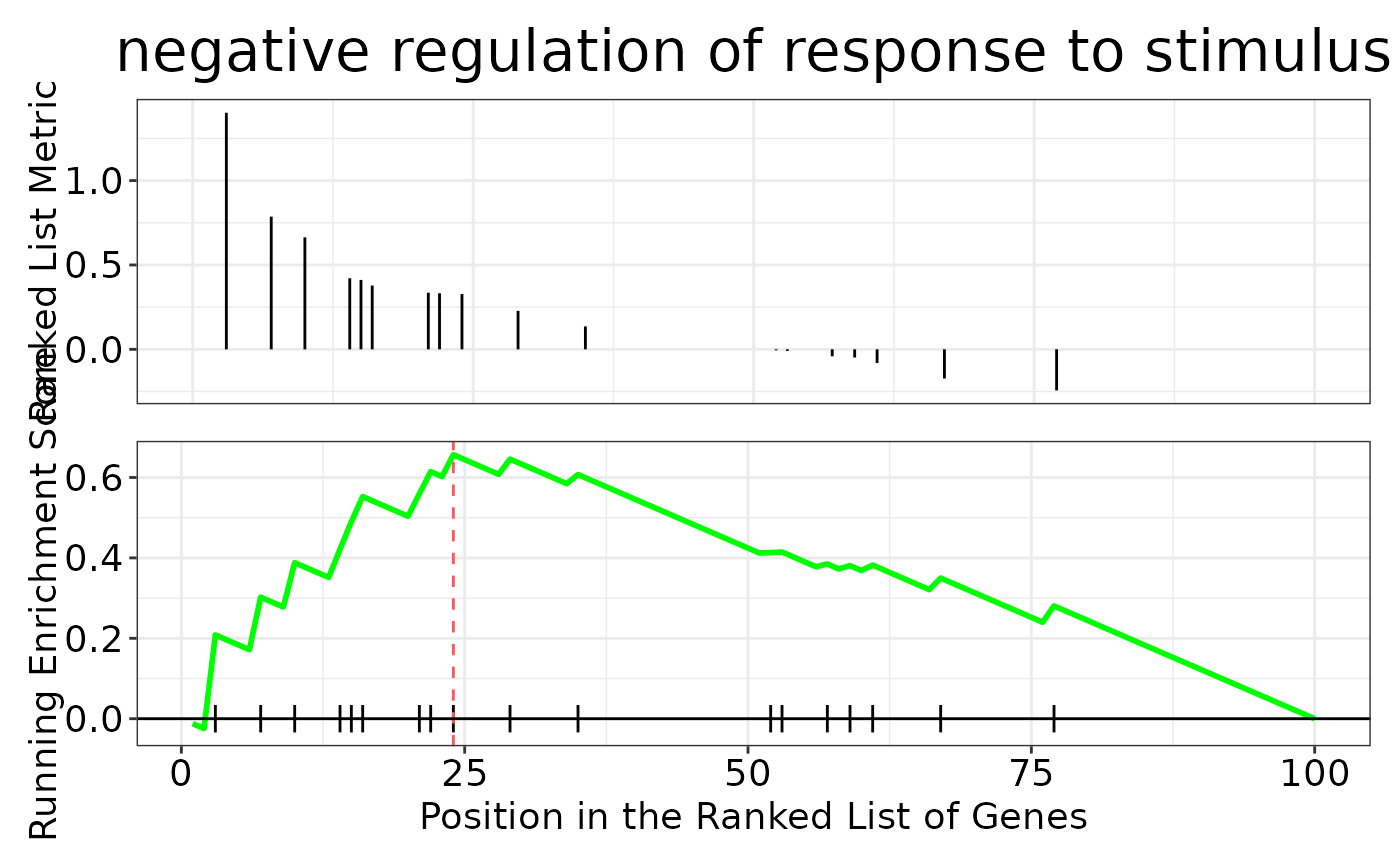 #>
# Remember that the data is artificial, this is why we use an absurdly high p-value cutoff
